I promised you I was going to start posting more and I’m trying to make good on that promise.
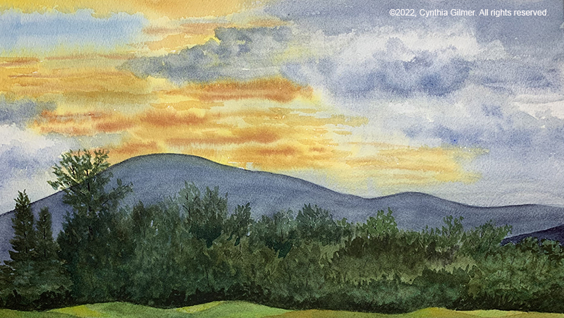
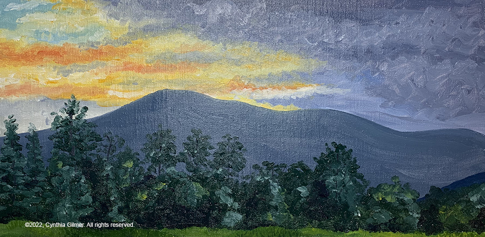
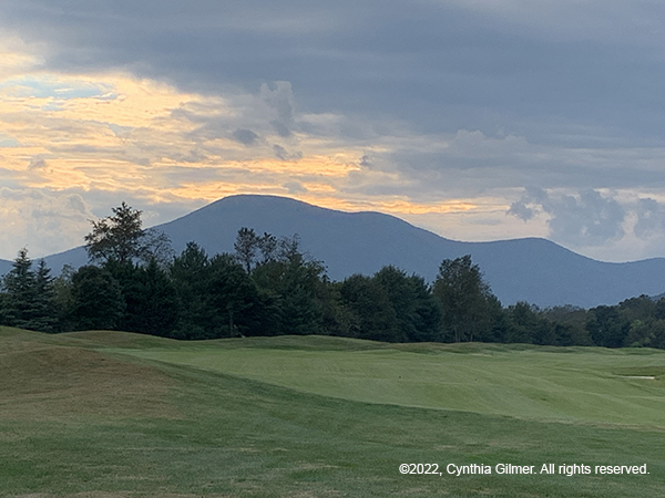
Several months ago I posted that I was working on an oil painting. I had a photo I had taken from the Stoney Creek Golf Course near where we live. It was of a sunset over Three Ridges, one of my favorite subjects. I had done a watercolor of it, but while I was doing that, I decided it would also be a great oil subject. I must admit I was very rusty, but I had fun. Here are both paintings, with the watercolor first. Neither is my best work but both have some good techniques in them. I posted the reference photo also.
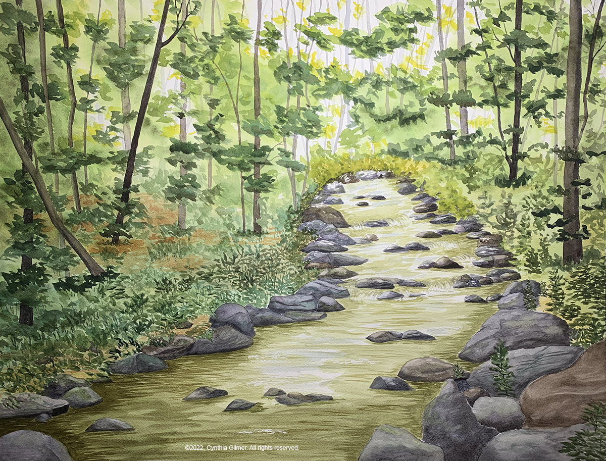
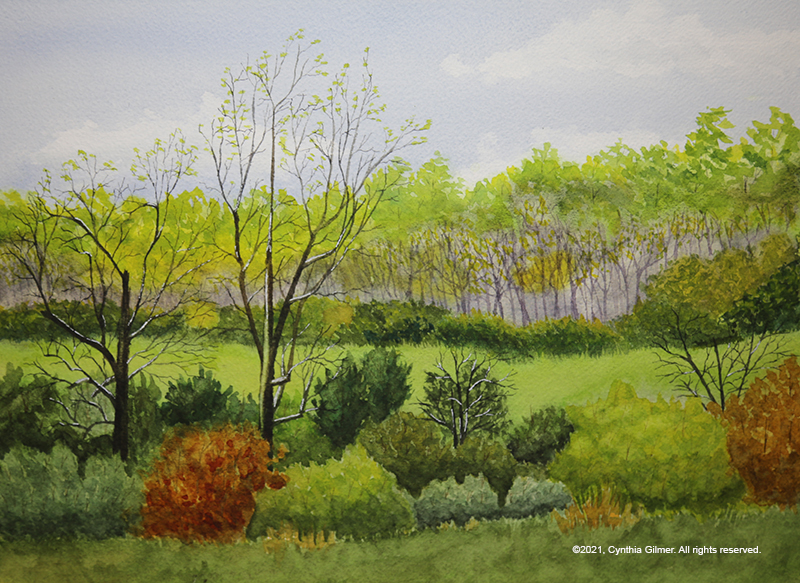
This next painting is one that I undertook to replace a large watercolor print that is in my guestroom that was left by the previous owners. I want to put something of my own there. It requires a large piece so I decided to tackle a picture of a stream 24”x18” format. It will be six to eight inches larger in each direction once matted and framed.
So one thing I haven’t learned is that streams are very hard. I have one successful stream painting that I did in oil, which I love. Others have all had issues in my eyes. This one is the biggest I’ve ever attempted, and I painted these rocks for a very long time. There are some things I like about it, but in general I don’t like it enough to invest in the framing. I really like the trees in the background. I did those first. I think the foliage around the stream should have been loser. The stream in the distance gives the illusion of being at an angle, which I tried to fix, but nothing really worked. It also looks kind of like it’s on a ramp. I might work on it some more. It may be salvageable, but I don’t hold out hope that it will ever be what I want to frame and hang in my guest room. I’m sharing this for critique, so opinions, both positive and negative are welcome.
That’s it for now. I’m experimenting with fluid acrylics and with my first use I really like them. Hopefully I’ll have something to share on that soon.
After a two-year break, Nimrod Hall Summer Arts was back up and running again this year as a fully functioning art retreat. In 2020 the season was canceled because of covid, and in 2021 they attempted to do an abbreviated version, but the year off left some of the buildings in a state of disrepair so they were unable to open. I signed up each of the lost years and was devastated each time I received the cancellation notice.
This year things were pretty much back to normal. Some of the buildings had gotten a facelift. The food was fabulous, as always. The group of artists who were there with me were wonderful. I really needed to get out of my funk and start painting again. Nimrod always helps with attitude.
The main building at Nimrod, built in 1783.
As I mentioned in my last post, which I’m sorry was so long ago, my previous Nimrod teacher, Kesra Hoffman taught in June this year. I was cruising at that time so I was unable to work with her again. I chose watercolorist Kathy Calhoun’s class instead. This was Kathy’s first year doing a full week, but she’s done many weekend workshops. She is a full-time art teacher in a private school. She seemed to want to provide more instruction than I prefer, but I did spend some time with her and I learned some things. The class had a diverse level of experience, which added to her challenge, but she did well.
We arrived on Sunday afternoon, settled in, and met each other. I rented a studio again, as I did on my last visit. This helps give me a place to set up where I’m not always carrying everything around. I brought watercolor, gouache, and acrylic with me. I wanted to be ready for anything.
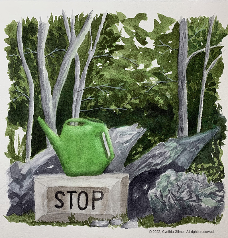
On Monday morning, I worked on finishing a painting I’d started in my sketch book some months ago. I needed to shake off the cobwebs. I’d done the foliage, but nothing else. The reference photo was a scene from my neighbor’s yard with a watering can perched up on a concrete block that says “stop”. It’s a fun little scene that I’d been thinking about painting for a while. I was happy with the result and felt a little bit more comfortable painting after the exercise.
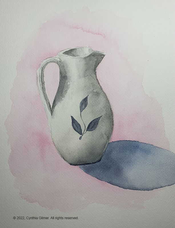
That afternoon, Kathy decided that we were going to work on still-life paintings as an exercise. I don’t do much still-life painting, so it was good practice for me. I chose a clay pitcher as my subject. We focused on shadows and highlights, and the cast shadow of the object. I should have included a surface edge showing the table in my background. Without it, my pitcher looks like it’s suspended in midair. I guess we know why I’m not a still-life painter.
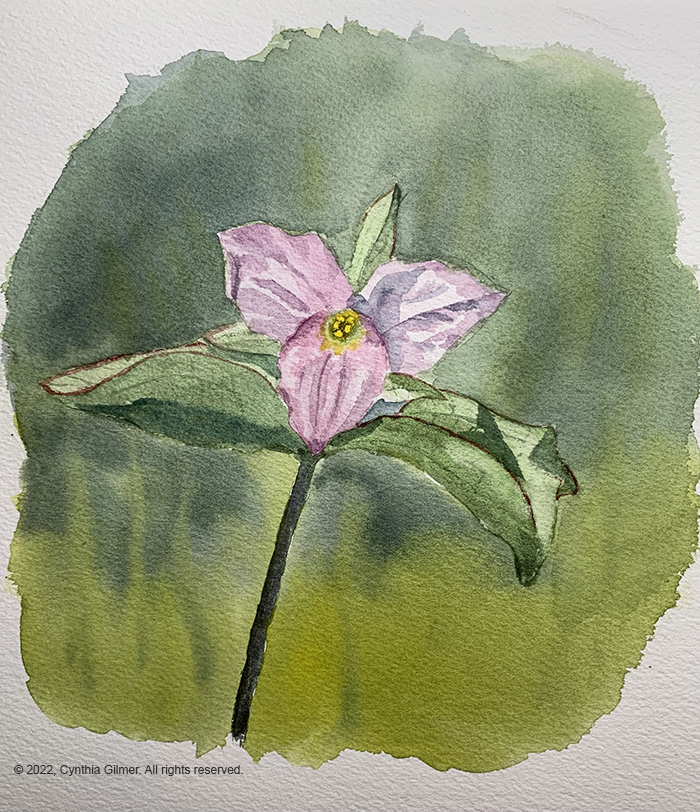
After the still-life exercise I went back to my studio and decided I still needed to get some of the rust off so I painted a flower. I don’t do florals often either. I chose a photo of a trillium that my husband, Bill, had taken. I like trillium, because it means that spring is about to make it up to our mountain top. It’s such a delicate flower. It’s a cute painting, but not great. It was still fun.
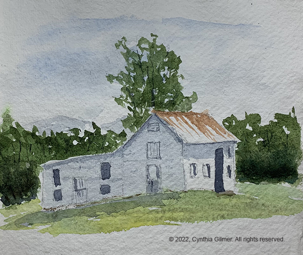
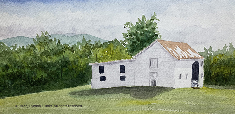
On Tuesday morning, Kathy decided we were going to do a plein air of the barn. I don’t really like to do plein air. I guess my tidy brain likes more perfection than you can achieve in the field, but I need to get better at it so I was happy to have the opportunity. Kathy emphasized doing a sketch first that helped nail down the color, composition and value. I normally wouldn’t do this, but wanted to follow directions, so I did a sketch in a little handmade sketchbook I had. I followed this by a full painting on a watercolor block. It’s funny but I, and most others who have seen them, liked the sketch better. It was looser and more fun. Perhaps this should be a lesson to me. Here it the sketch followed by the painting.
I was inspired by this exercise to sign up as a participant in the Rockfish Valley Foundation’s Plein Air Paint Out in October. More info on that later.
On Wednesday I opted out of Kathy’s sessions and decided to paint alone. It was a lovely sunny morning so I started with another plein air of one of the Nimrod cottages, Sunset 3. All of the cottages have challenging perspective. I tried to maintain what I learned about being loose from Tuesday’s session. I’m not crazy about this one, but it’s good plein air practice.
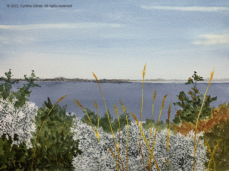
In the afternoon I decided to start on an experiment that I’ve wanted to try for a while. I wanted to do a mixed media using watercolor and gouache (opaque watercolor). I had a photo I’d taken at Westmoreland State Park on the Northern Neck. It was looking out over the water, and there were wildflowers in the foreground. I knew the watercolor washes would be best for the sky, water and foliage, but there was no way to capture the flowers and grasses well using watercolor. I started with the sky and water. I had a little trouble with it bleeding along the horizon, but I was able to recover it. Then I did the foliage. I variegated the foliage that would be behind the flowers so that you would still see some of the light and deep greens. Then I switched to gouache and painted the flowers and the grasses. I really liked the result. Other artists responded positively too. I am going to start using this technique more.
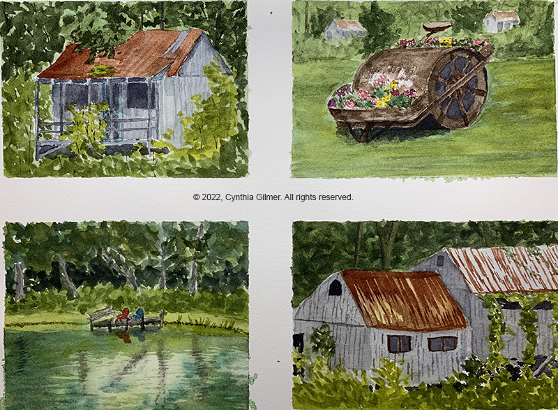
I finished the above painting on Thursday morning. Late morning Kathy came by and said she’s challenged her students to do three paintings with a theme in the afternoon. I had gone down by the pond and boys camp on my morning walk and had several pictures so I divided a piece of paper into four smaller sections and worked on four paintings from those photos. I paint fast, so the time frame worked for me. I rotated between the four paintings, letting each dry in between layers. I do admit that I got fatigued and it shows in the level of detail, particularly in the bottom two which I finished last. I put off finishing the one of the pond because I didn’t like the initial reflections, but I was eventually able to recover them somewhat. The perspective on the two boys camp cabins on the bottom is wrong. I was below them but the painting shows them from above. My favorite of the four was the roller with the flowers. That one was really fun to paint.
Thursday evening was the walkthrough, when everyone walks around and sees the work everyone did all week. This always ends in Nimrod owner Laura Loe’s studio where she shows us all of her recent works and paintings in progress. She has a unique style, so it’s always a treat to see her work.
It was a wonderful week and just what my artist’s soul needed. I am pleased that I made a commitment to the plein air event because hopefully that will keep me painting.
I know this was a long post. If you read to here, thank you! I am hoping to be painting and posting more regularly going forward. I have some things in my studio that I haven’t shared yet, so I’ll try to start with those.
So far the new year looks a lot like the old year, which looked a lot like the year before that. I keep hoping that someday things will start to look better again. To be honest, Covid has sapped a lot of my inspiration. Some would think that I should be painting like crazy, but it doesn’t work like that. I need inspiration, some of which comes from the stimulus of going places and seeing things. I haven’t been doing much of that.
I looked at how few blog posts I did in 2021, and it is really sad. I have been painting some, but not blogging about it. I am going to try to change that in 2022. Let’s start by sharing a few things I’ve done recently.
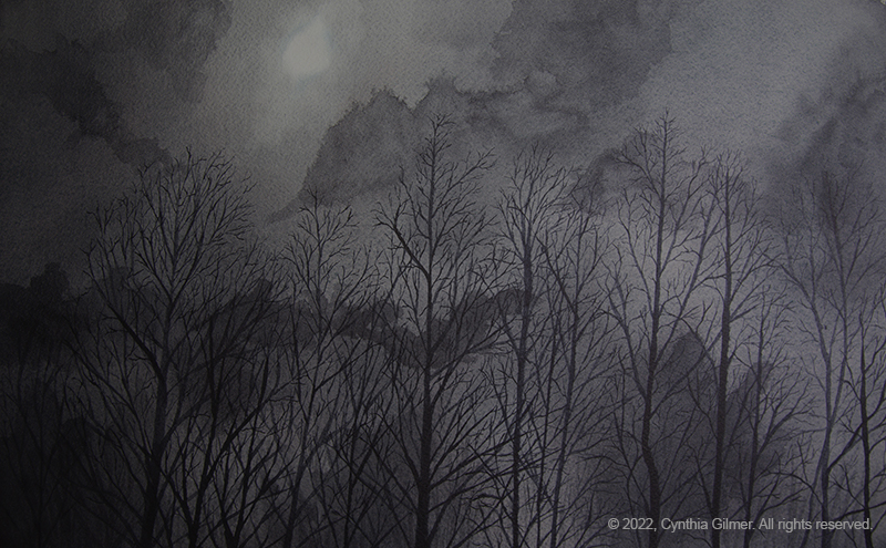
The first one is from a photo taken by an online friend of mine who lives in Finland. It’s a lovely monochromatic photo of a moonlit night. When I first saw it I though it would make a beautiful oil painting, and I might still do that, but after I though about it for a while I though it would also make an interesting watercolor project. The background was done in a series of washes with various cloud structures. I actually used several different muted colors so it’s not simply gray. I masked out the moon to keep the white, and also realized that in order to make it glow I would have to go darker and darker with the washes. Once I was happy with the background I painted the trees. Painting all of those little branches was one of the most relaxing things I’ve done in a long time. I didn’t really do my friend’s photo justice, but I think it stands as its own artistic interpretation of the scene. It is 16×10 on Arches 140lb cold pressed paper.
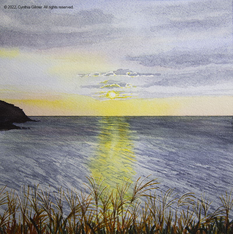
The second one is also based on a photo from an online friend. This one was taken in Korea of the sun setting over the sea. I did this one in a sketchbook first and didn’t really like the result. I thought I could learn from my mistakes so I attempted it a second time. I was happy with the result. The first version didn’t really capture the ripples in the water, nor was I as happy with the sky. Both of those are better in this version. The sliver grass in the foreground was fun to paint. I enhanced it with a little white ink to get it to glow. This is a small painting but it has really good depth. It is 8×8 and also on Arches 140lb cold pressed paper.
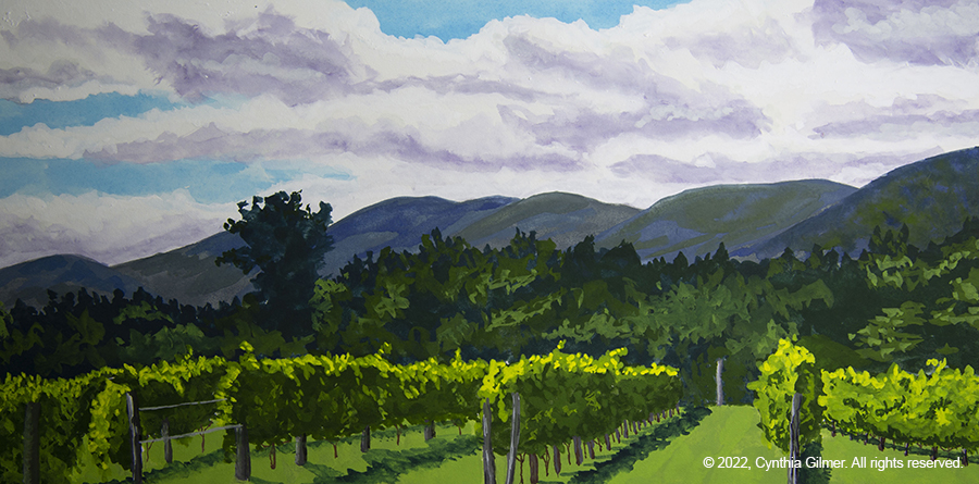
The last one is something different. It’s of a photo I took of Afton Mountain Vineyards several years ago. I’ve painted it in oil and watercolor before. This version is in gouache, also known as opaque watercolor. I don’t have much practice using it, but last time I went to Nimrod Hall Summer Arts I took classes from Kesra Hoffman and she does magnificent landscapes in gouache. I’m hoping to get more practice using it in the coming months. This is 12×6 and is painted on Arches 140lb hot pressed paper.
Speaking of Nimrod Hall, I’ve signed up the past two years and both years they have been forced to cancel their season due to Covid. As they say, third time lucky. I have signed up for a week in mid-July. Kesra is teaching in June and I’m hoping to be cruising around Spain during that time, so I had to chose a different teacher. I’m really just looking forward to a week of intensive painting.
I’m hoping that it won’t be so long before my next post. I recently broke out my oil paints for the first time in years. I have a work in progress that I hope to share soon.
So a few weeks ago a dear friend’s daughter, Marla, got married. I’ve known Marla since birth so it was great to see her marry Ben, a handsome and successful young man who appears to love her very much. They had planned the wedding for September of 2020, but as we know, very little celebrating went on in 2020. It was a blessing to be able to share their joy, even if it was a bit delayed.
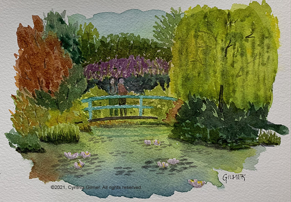
So what does this have to do with art? I sent them a nice gift from their registry, but registries have always felt impersonal to me. I planned to take them a card to drop off at their ceremony, so I decided to paint a little watercolor sketch to put in the card. I didn’t really care what they do with it, but wanted to give them something of myself and my wishes that they have a life of travel and adventure. I chose a scene from Monet’s garden, but only loosely interpreted from the photo I had. My trip to Giverny was very special to me.
It’s a cute little sketch. It’s not meant to be a masterpiece. I decided to put two people on the bridge. They aren’t really meant to look like Marla and Ben, but I wanted two people in the scene. People are difficult for me and painting them is something I wish I was better at. I think people add interest to scenes be they urban or rural. So, I’m vowing to practice and get better at them. In the mean time, I hope Marla and Ben excuse the inadequacies of the people I included in their little sketch. I just hope that when they look at it and see the people on the bridge that they imagine all of the places they can go together. Wishing them many happy adventures!
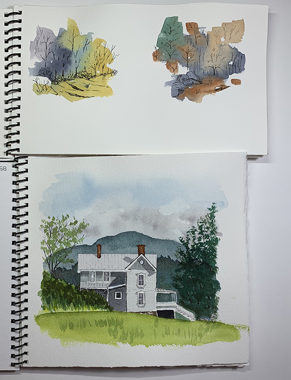
In my last post I mentioned that I was working on something in my sketchbook that I was going to share. One challenge with using sketchbooks is if you do something you really like it’s in a sketchbook and you can’t do anything else with it, because it’s attached to the sketchbook. Also, while you can get watercolor sketchbooks with good 100% cotton paper it’s still different from the paper I’m used to painting on. The way watercolor interacts with the paper, and the way the paper absorbs the watercolor is extremely important to the outcome, so I have become very picky about the paper I use. I always use Arches 140lb. cold press paper. You can’t buy a sketchbook with that paper, unless it’s hand crafted. I’ve gotten them off or Etsy but they are very expensive.
A few years ago, I took a class on Traveling with Watercolors at the Beverly Street Studio School in Staunton, VA. The teacher made her own sketchbooks with Arches paper. She would cut the covers from mat board scraps and she’d cut the paper to fit. Then she’d take the whole thing to Staples to have them punch and bind them. I did a little research and figured out that the binding machines don’t really cost that much, so after about a year of thinking about it I bought one and started making my own sketchbooks. I have done two so far. I just filled up the first and started painting in the second one.
Here they are closed so you can see the covers and how they are bound.
And here they are open so you can see some sketches on 100% cotton Arches 140lb. paper.
Anyway, one advantage to using sketchbooks that have nice paper is if you get really lucky and create a painting that might be suitable for framing, you can detach it and frame it.
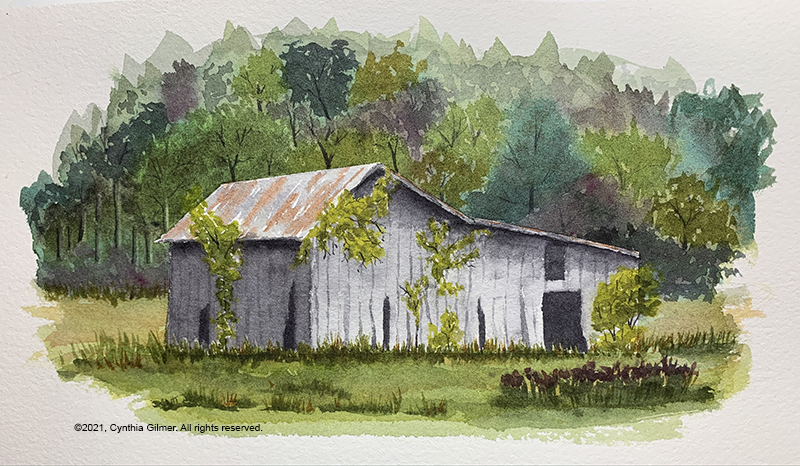
I had taken a photo of a small barn in the valley across from Devil’s Backbone Brewery. I didn’t really like the setting, but the barn itself had a lot of character. I thought I would practice Steve Mitchell’s spontaneous watercolor techniques to do the background and then I’d paint the barn from the photo. Masked the barn with tape and then painted the background. The spontaneous method requires a lot of random paint, water, blending, running, dripping and spraying. Then you use the random shapes and create more detailed aspects of a landscape from it. I really liked the outcome.
It is looser than most of my work but the barn is still quite detailed. It also has white space around it, rather than filling up the whole page. That’s actually a function of the sketchbook because I don’t feel compelled to paint to the edges. I don’t have to paint to the edges on other paper either, but I have this engineer’s brain that really wants to fill up the page. I’m going to use this as an inspiration to stop doing that.
It’s small, about 7 x 9 inches. I bought a small frame and I’m going to remove it from my sketchbook and frame it.
I’ve been doing a little painting, but haven’t been very inspired to write about it. When I was editing the photos for this post I got even more discouraged. The three paintings I’m going to share are all okay, but they feel simplistic and amateurish. I’m not getting better… but that’s because I’m not painting enough. I obviously need to work on discipline.
The first painting is from a photo of a stream crossing a field. The photo was taken a few years ago in the springtime. I’ve painted this scene before but I like it so I decided to do it again, using a few new techniques. I tried to loosen it up a little. I think I was moderately successful doing that.
What I like about this painting is the tree canopy in the background. I’m not really crazy about most of the foreground though.
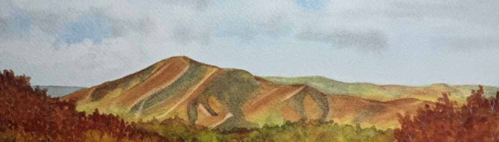
The second one is a bit different than my usual style. This is a from a photo at the Three Ridges overlook in Wintergreen. I went with a really dramatic sky. I wanted to practice my hard edged puffy white clouds. I like them, but there were some places where it didn’t work. The can easily get too angular. I did some scrubbing of those areas and that gave me some really interesting wispy effects. I also had a lot of fun doing the highlights along the ridges. I like the way that came out. Some of the plants and trees in the foreground are okay. Others I don’t really like.
The last is a barn in a field in Afton Virginia. The photo for this wasn’t great – the lighting was very bad. I had to use a lot of imagination.
What I like most about this painting is that I got pretty good depth in the trees and field behind the barn. I enjoyed painting the trees to capture that each was behind the one in front of it. That may seem simple, but it’s really easy to miss that nuance and get a really flat image. The tree in the foreground had highlights that I wanted to capture so I masked part of it. I augmented these with some white ink, but I think it came out okay in general. The ground it kind of boring, and the barn lacks interest. The barn was the worst lit part of the photo, so it was hard for me to get a feel for it.
I think I need to play in my sketch books for a while rather than trying to do full paintings. I’m working on one there now that I’m kind of excited about. I will share soon.
This is going to be a long post, but it’s something I really want to make sure I capture, for myself and others who might be interested.
During the later half of my career, I spent a lot of my time doing what is known as human centered design, or design thinking. Design thinking is a problem-solving approach with a unique set of qualities: it is human centered, possibility driven, option focused, and iterative. (2017, Liedtka, et al.) It is also known for applying designers’ sensibilities to problem solving.
I often talk about my engineer’s brain and my artist’s brain, and how the two don’t work together. It has always puzzled me that I could not figure how to get my design thinking experience to influence my art. One challenge to this was that I usually paint for myself, making me the human at the center of the design effort. This means that I either like it or I don’t. Yes, I learn from my failures and I move on, but it’s hard to put a formal process around this.
My friend Carlo, who follows my art journey, came to me some months ago and asked me if I could do a painting for him and his wife Mary, of a place they once lived on the Magothy River near Annapolis Maryland. I have never been there. He sent me a couple of photos and I did a quick watercolor sketch and sent it back to him just to get his feedback.
Carlo Sketch 1Carlo’s original photo. While everything else changed, the sailboat remained.
It was a good thing that I did, because while I duplicated the photo pretty exactly (except for the townhouses), the scene he was remembering was really quite different. I realized at that point that I actually had an opportunity in front of me to use all that I knew about design thinking to explore Carlo’s memories and attempt to develop a scene that would evoke the pleasantness of those memories.
I spent the next few months going back and forth with Carlo. I learned from that first sketch that it was important to show the perspective of the distant shore correctly. He pointed out that the river is over a mile wide from this vantage point. He sent more photos and I did an additional sketch. Each subsequent sketch was a composite of the earlier ones applying what I’d learned.
Carlo’s photo that inspired the final design of the pier.Carlo’s photo that inspired the coloring of the sky. Carlo Sketch 2
From discussions about this sketch I learned that the trees in the foreground on the right were not actually there (or should I say, not really in the scene he was recalling). I also learned that the bright yellow sky was overwhelming and made Carlo think sunrise more than sunset. He also mentioned at this point that he liked the pier going straight out of the center of the picture.
Based on what I learned I did two more sketches. Note that I wanted to test giving him multiple options to compare, so I didn’t show these two until later.
Then, I posted all four paintings together on a private page of this web site and this time I asked him a set of pointed questions and ask him to respond for each painting. Here were the questions:
What do you like most about the painting and why? What do you dislike about the painting and why? How does the painting make you feel?
This turned out to be an interesting exercise for me and I think also for Carlo. I learned a few key things from his feedback. First, I learned that even though the first painting missed the mark in almost every way, he liked the coloration of the pier most in that painting. I also learned that sketch 4 was his favorite, so I had a target to follow. I learned that he gravitated toward a calmer water appearance. He reiterated that he didn’t like the coloring of the sky in sketch 2. He didn’t like the prominence of the pier in sketch 3.
The other thing that emerged from this discussion was the size of the planned finished product. We were originally targeting a large painting for over their fireplace, but as I did the smaller sketches he was reminded of another print of a water scene he has and decided he’d rather have a smaller painting that he could pair with that painting. He would never have made this connection if we hadn’t gone through the iterative process of doing the “prototype” sketches.
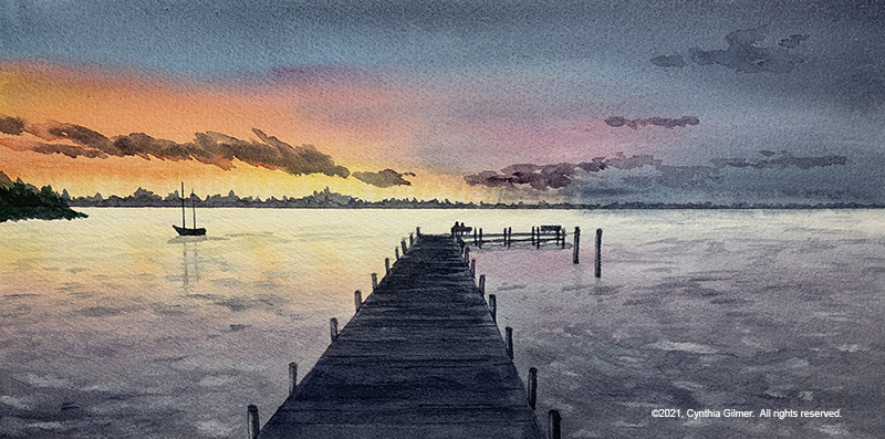
So based on everything that I learned, I painted the final product. The painting is 11.75 x 6, to match the print he wants to pair it with. That print has whitespace between the painting and the mat, so I taped off the frame on a larger piece of paper so he could duplicate that. Finally, I focused on the coloration of the sky, the distance of the land on the far side of the river, the calmness of the water, and the lighter coloration of the pier. Here is the finished product.
Carlo Final Painting
So, back to the original topic of this story, here’s what I took away from this process. Designers are artists, but artists are not necessarily designers. Even trained designers are really just artists when they are creating for themselves. Visual design takes artistic ability, but designing something someone else requires a human-centered process. This is where the connection is, with the act of designing for others, not with the underlying art. The real take-away is that I can use my experience in design thinking when I am painting for others to develop a product that they will be delighted with. If you got this far, thanks for listening.
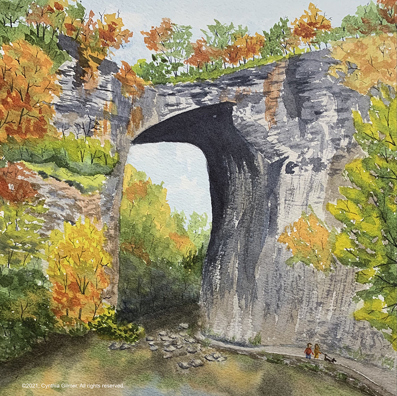
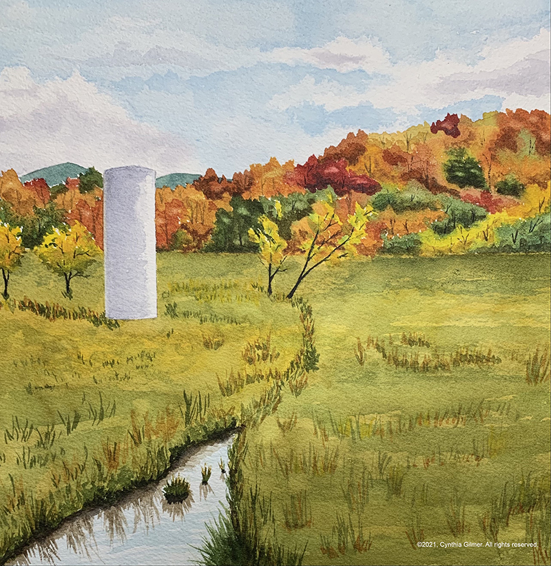
As a landscape painter, most of my paintings are, as the say, landscape orientation. That means they are wider than they are tall. Sometimes you just want to do something different. To that end, sometimes I look for scenes that can be painted in different orientations, and lately I’ve been having fun painting square.
Today I’m going to share with you two recent paintings, both of which are eight inches square. The first one is of Natural Bridge, a wonderful natural landmark about an hour from where we live. The reference photo was taken in the fall of 2019. It was a stunning day and the leaves were at peak color.
The next is of a scene in the town of Nellysford Virginia. I’ve painted this a few times recently, so it might look familiar. The reference photo was actually taken in the spring, but I wanted an autumn version of it. Painting fall colors is so much fun.
I mentioned in a post a while back that a B&B in Harrisonburg Virginia approached me with a collaboration opportunity to hang some of my art in their inn where it would be for sale to guests and anyone else who might be interested. I saw it as a great way to increase my name recognition as an artist, so naturally I said yes.
The Friendly City Inn is in a beautiful old building that was previously known as the Stonewall Jackson Inn, but new owners Becca and Joel chose to change the name and minimize the Civil War theme. This required renaming and changing the themes in each of the rooms to something more focused on the beauty and landscape of the Shenandoah Valley. One of the big changes needed was to replace the Civil War themed art with something else, which led to an idea of collaborating with local artists. I am flattered and pleased to have been chosen.
They asked me to focus on local landmarks and mountain landscapes so I chose six paintings that I thought would show well. Then I was faced with the daunting task of matting and framing them all. This took a little time but I finally had them all ready to go so I took them to Becca last Thursday and she busily went to work looking for appropriate places to hang them.
I think most of the pictures I provided have already been featured in another post. Since I carefully matted and framed them all I thought that I’d photograph framed pictures for the post. It’s hard to photograph framed watercolors because of the glare from the glass, which you will notice in some of the photos. Still, I think you will get a feeling for each finished product.
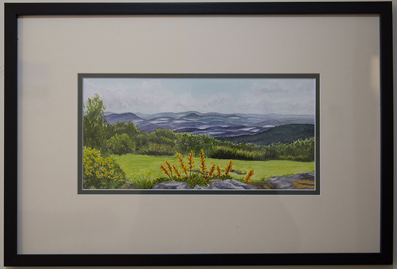
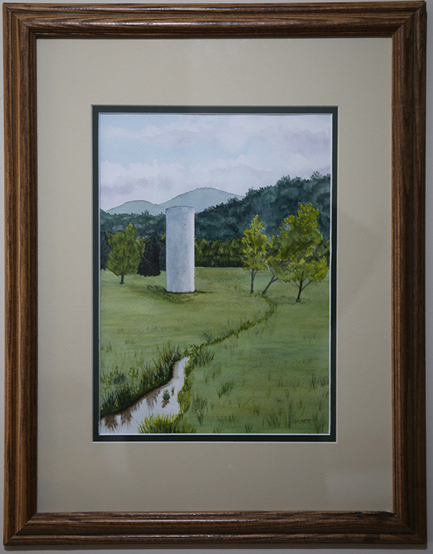
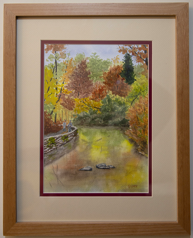
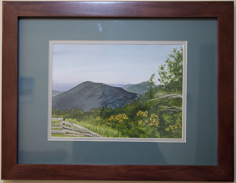
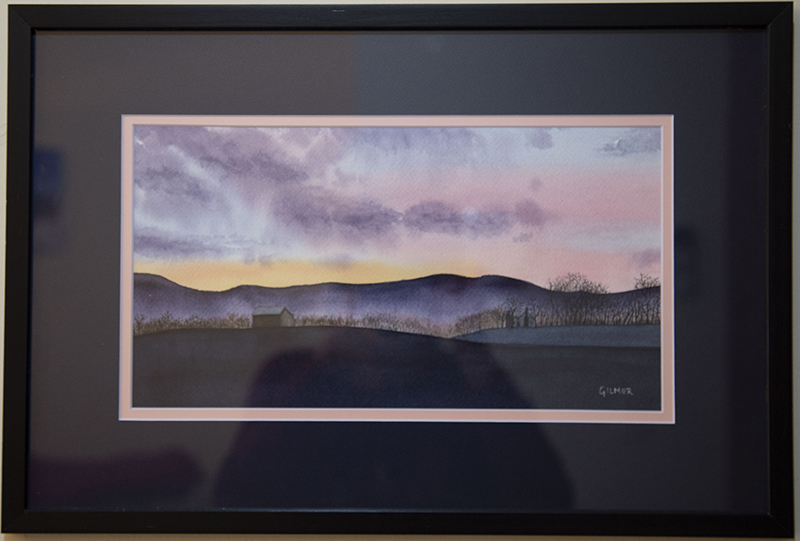
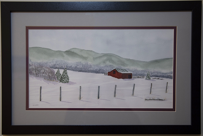
Misty Morning (Shenandoah Drive)Spring in NellysfordAutumn Stroll (Natural Bridge)Three Ridges OverlookSunset Behind the Blue RidgeShelter From the Cold
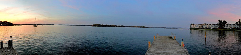
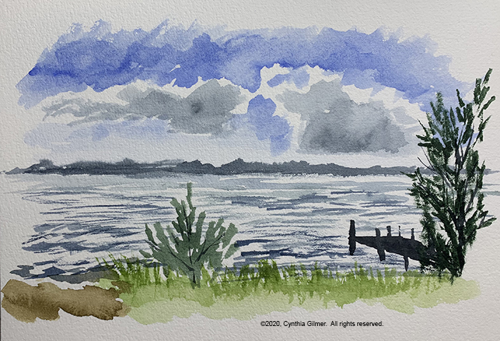
So we recently got brave enough to take a trip in this age of COVID-19. We rented a house on the very tip of Virginia’s Northern Neck for a few days because water is a nice change from our mountains. It was even more secluded than here. The house was right on the banks of the Rappahannock River just where it meets the Chesapeake Bay. It was a stunningly beautiful location with gorgeous sunsets. The outdoor space had a dock, and a picnic table deck right on the beach. I usually take reference photos and then paint from them in my studio. I don’t do much plein air painting, but was such a wonderful opportunity to do some that I went for it.
Plein air painting is more about capturing the feeling of the place, and less about capturing a perfect image. It’s about painting loose and quickly. So don’t expect polished paintings, but I had fun and I like the sketches that I did.
The first is a view looking across the river toward the southwest. The dock was in the foreground slightly obscured by small pine trees. There were dramatic clouds in the distance with bright white tops. I was not happy with the clouds in this painting. I actually don’t like this sketch very much, but I was just warming up.
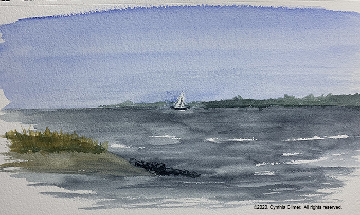
The second was looking the other direction, down the river towards the bay. There was a small beach and jetty in the foreground and one of the few sailboats we saw, which is odd given that October is a big sailing month for this area. There were small waves in the water reflecting the sunlight that I tried to capture. The sky was clear in this direction. I like this one better.
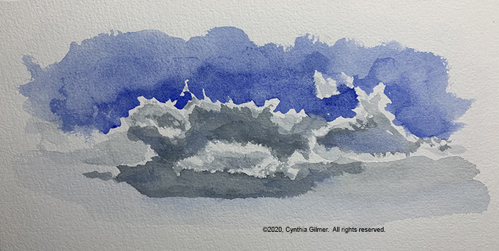
I was still annoyed with the clouds in the first painting and decided that I needed practice. I love clouds with brilliant whites and varying shades of gray. When I paint skies I usually do wet in wet to get softer edges. To get those dramatic whites you need to do hard edges and I can never get it to work. My engineer’s brain says clouds are soft and fluffy and that doesn’t mix with hard edges.
My first attempt has very hard edges but the darks are too big and don’t have enough gradation. Mostly this just looks messy to me.
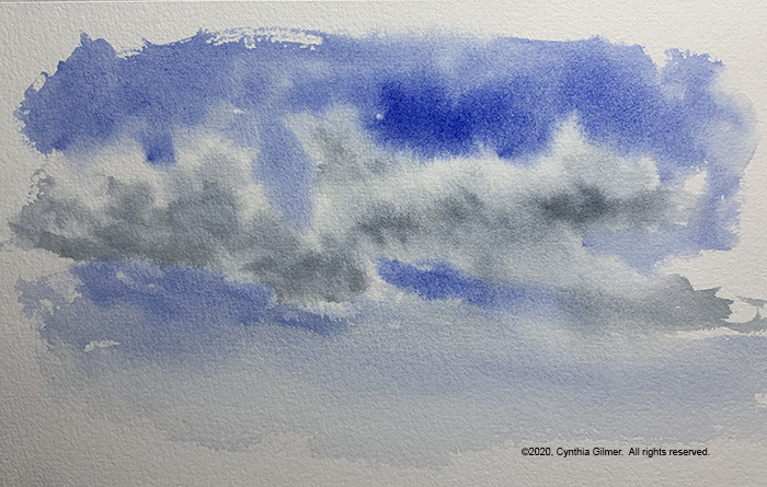
In the second attempt I gave into my desire for softer edges, but I was careful to leave a lot of white. I like this one better, but this is something that I really need to practice a lot. Some people are so good at it.