6×6 Paintings – Help Me Decide

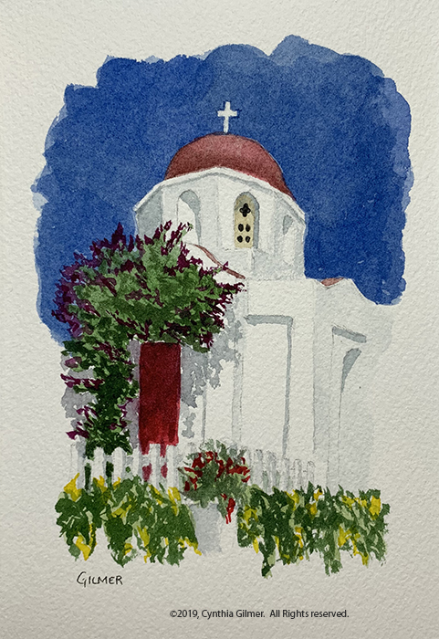
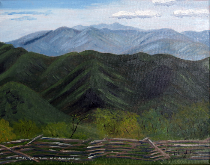
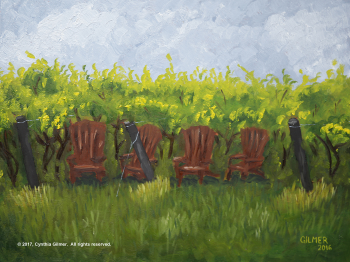
So several years ago when I first started experimenting with watercolor Falls Church Arts did a 6×6 to 12×12 show where they wanted all works to be square and in that size range. I painted two 6 inch x 6 inch paintings from photos taken in Wintergreen and Italy and entered them into the show. They were accepted, which was nice, but when I look back at them now I think how far I’ve come.

I decided I wanted to reuse the frames, so I set out to paint two new 6×6 paintings. I didn’t like the first two I did so I started painting more and before I knew it I had seven 6×6 watercolor paintings. All have good and bad points, as with all paintings. I can’t decide which two to put into the frames. I thought I’d share them all and let my readers help me choose.

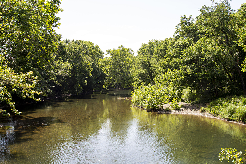
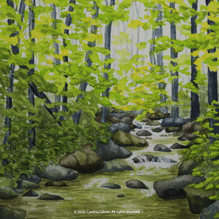
The first one is from a photo I took several years ago of a stream running through a field not far from where we live. The photo was taken in the early spring, and the real problem with this one is that I tried to change seasons to summer, but didn’t change the large trees in the foreground. In the photo they were just barely leafing out, so they ended up looking like dead trees. I tried to add more leaves to one of them, but the result is not the best. I still like the peaceful feel of the scene.

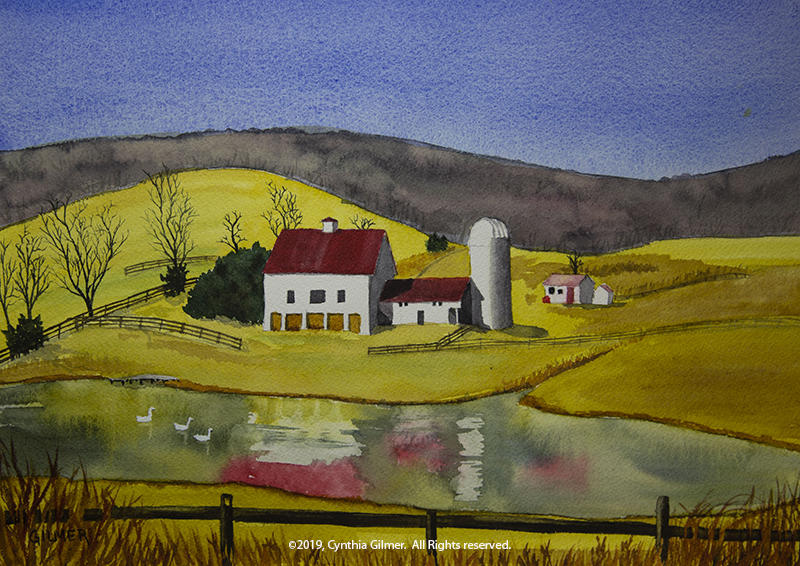
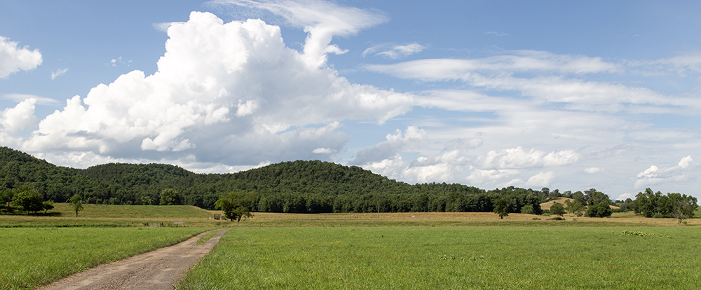
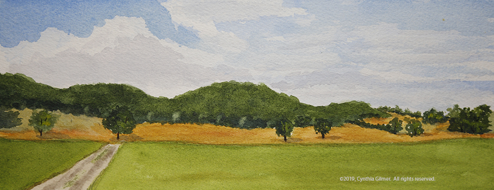
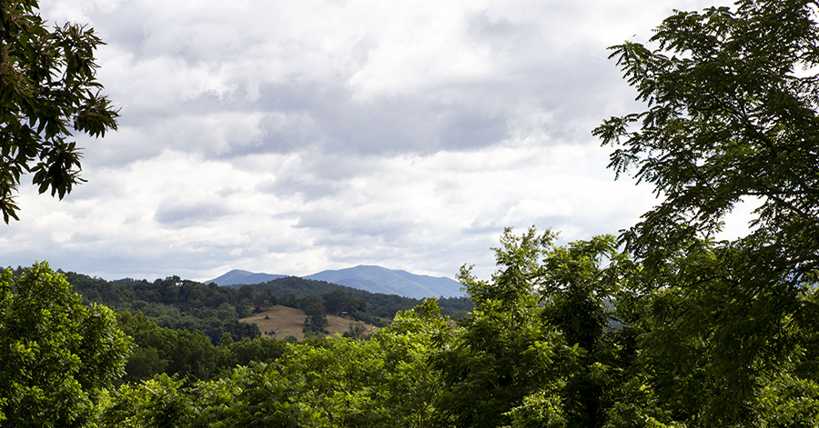
The second painting, which was really done simultaneously with the first, was from a photo of Three Ridges from the valley. I changed the house on the right to a barn, but not a very good one. Plus it’s too far right which hurts the composition. In my opinion, this one is just ho-hum.

After I did these first two and didn’t like them I decided to try some things that were more ambitious. Both were scenes I’d done before, but not in this form factor. I’d also been practicing some techniques that I thought were well suited to these subjects. I like these two better than the first two, but don’t let my opinions influence you. If there’s anything I’ve learned over the past few years, it’s that art is very personal. People like what they like.

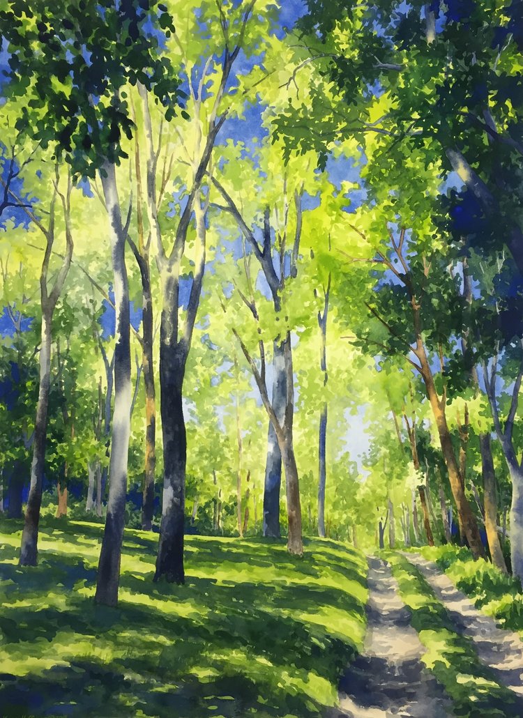
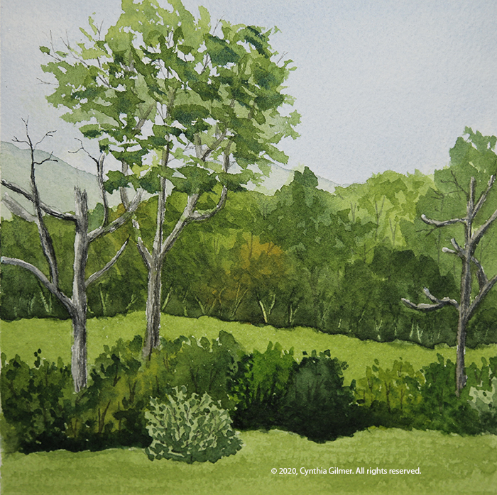
One of the things I’d been practicing was rocks, trying not to over obsess with the photograph and just letting the shapes and groupings form as I painted, sort of like doodling. So I did this scene of the stream that is in our backyard. It’s fun because of the light dancing through the trees. I used white acrylic paint to make the little rapids pop.

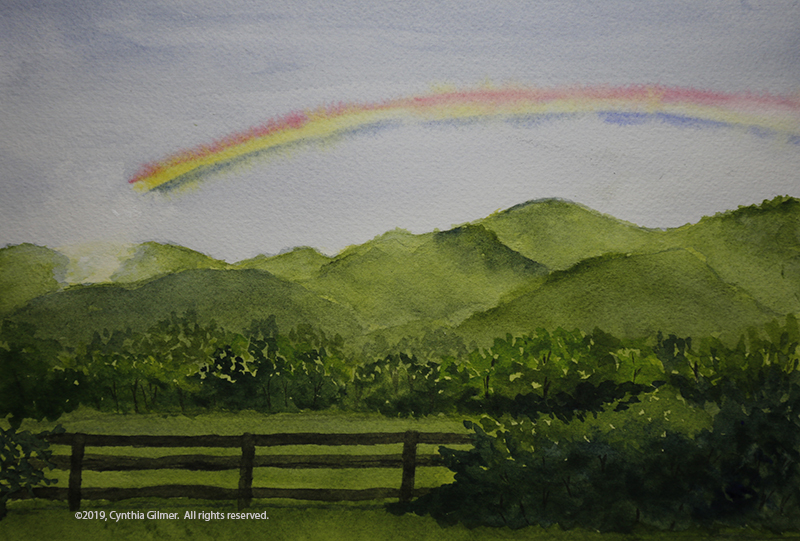
There’s a waterfall on Route 56 in Rockbridge County that is on private property but the owners have generously let people stop to photograph and enjoy the scene. I recently heard that they had stopped allowing this because some people had been destructive, which is very sad. In this painting, I had fun with the deep shadows behind the falls and the spatter of the spray, using white gouache. It was a happy accident that I got a misty feeling along the edges of the falls and the surface of the water.

Having done those two I was on a roll, starting to have fun with the small, square form factor. I liked the fact that I could knock them out relatively quickly, so I just kept going.

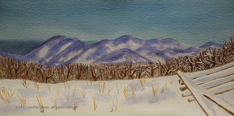
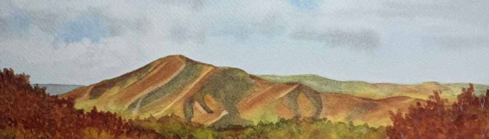
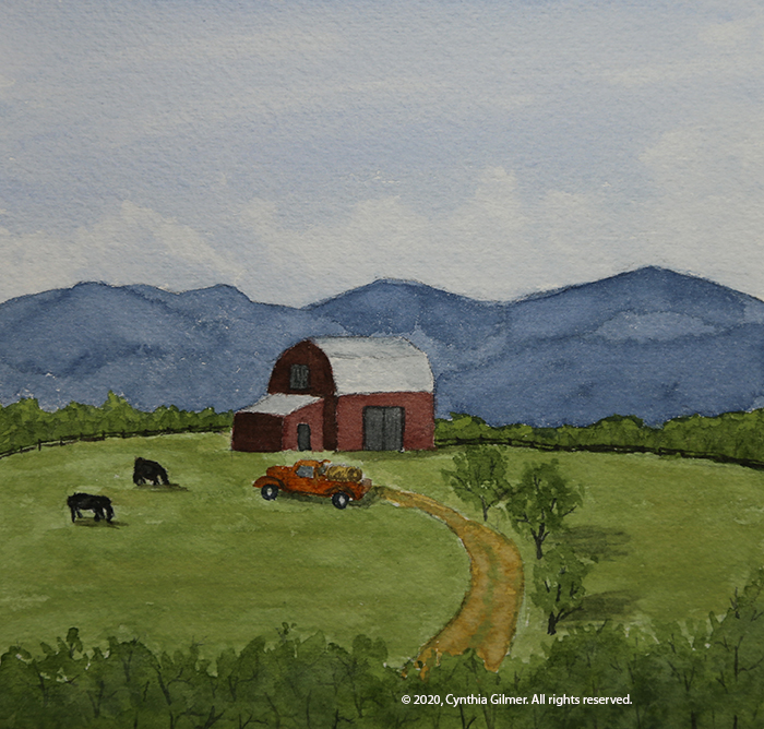
There is a barn that you can see from Route 29 in Greene County that is beautiful in the morning sun with a backdrop of the Blue Ridge. I’ve never gotten a good photo of it because there’s no place to stop. All I have are a few bad cell phone photos taken from a moving car. I used one of those as the inspiration for this next painting, but I modified the scene a lot. I added the cows, the truck, and the road. I also changed the trees in the front. Unfortunately, the resulting composition isn’t the best. The barn is too much in the center, breaking the rule of thirds. I like the effect of the mountains. They represent one of those situations where the watercolor painted itself.

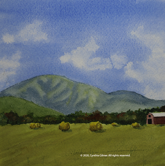
This next one is of Afton Mountain Vineyards. I’ve done this in oil and watercolor before, but set out to do this one quickly. I took a very different approach with the sky than my usual technique. I let the hard edges define the whites. The result is more dramatic and less subtle than my usual skies, but I like the result. I may try to use it more often.

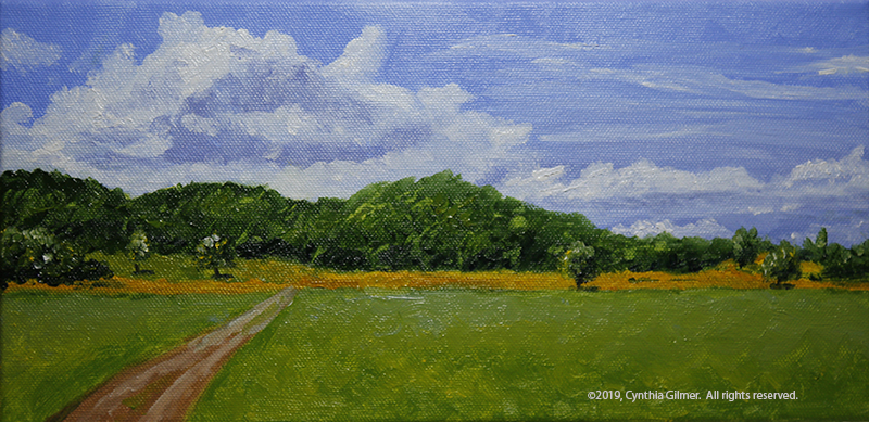
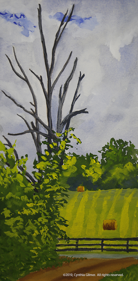
Finally, I decided to do the cub creek barn again. I recently watched a video from my favorite online instructor, Steve Mitchell from the Mind of Watercolor, where demonstrated using a nib pen to apply watercolor to detail a painting. I used that here. I really like the technique and I’m sure I’ll continue to use it a lot.

Those are the seven I have to choose from. Let me know which two you like best.

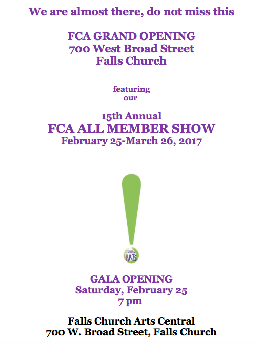
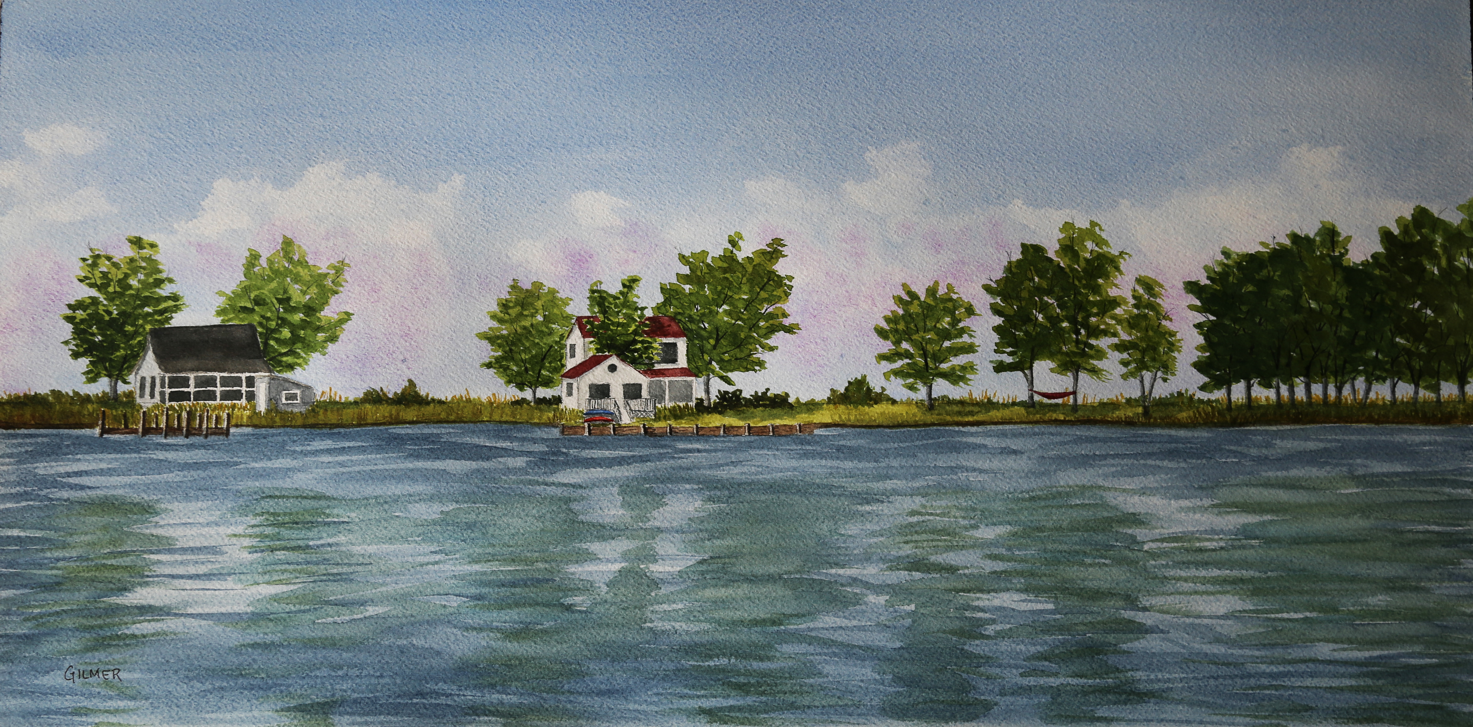
In other news (I really need to blog more often so my posts aren’t so long), I have two paintings in shows this month. The first is one I did a couple of years ago from a photo I took on Tilghman Island. This is in the Falls Church Arts All-Member Show, which runs through March 8th.

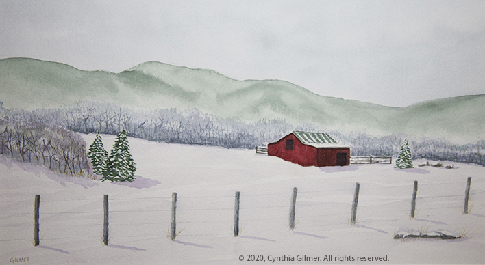
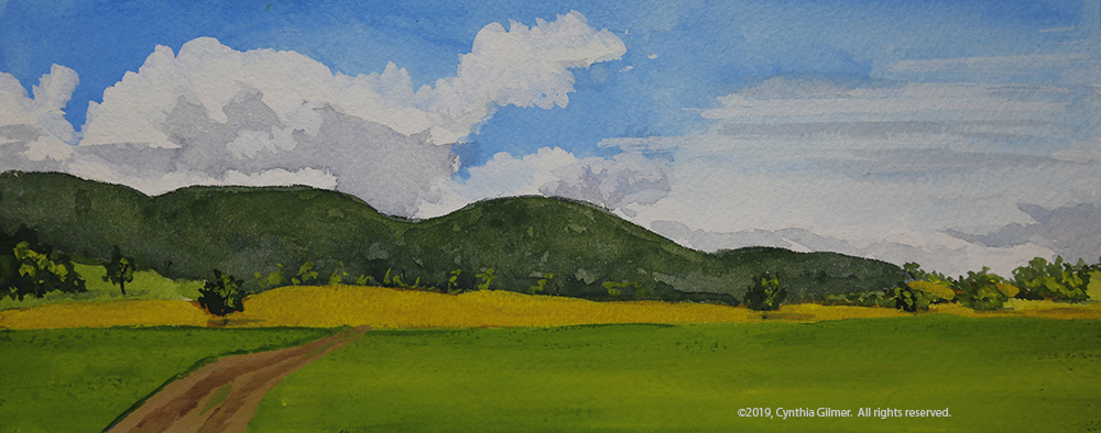
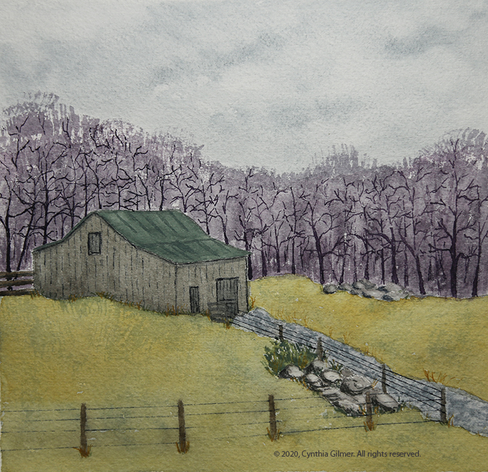
The second is in the Shenandoah Valley Art Center’s monthly member show, which is themed “red” this month. I painted this specifically for the show. The photo is the same one used for the painting of the cub creek barn above. It was taken in the late summer, so I needed to drastically change the seasons, and the color of the barn to make it fit. I’m pleased that I’m getting better at using some artistic license to change the material I’m working from, although sometimes I’m more successful than others. This painting is on display at SVAC through March 3rd.

September 2019 Shows

Please go to the to right of my home page and provide your email to subscribe to this page if you want to see all of my posts.  Please note that you will receive an email and you must confirm to complete the process

I have four paintings in two different shows in September and October. That’s a first for me and I’m very excited.

My painting Paris Barn, was accepted into a juried show at Falls Church Arts. The juror is Glen Kessler, a Rockville Maryland based landscape painter. I’m always proud when my work is accepted into a juried show.

The reference photo for this painting was taken by Breck Carter, and was posted in the Exploring Virginia group on Facebook. It was used with permission from Breck.

Paris Barn – 14×10 Watercolor

This show will be on display from September 14th through October 13th at the Falls Church Arts gallery located at 700-B W Broad Street in Falls Church City.

I also put three works into the member show at the Shenandoah Valley Art Center in Waynesboro VA. This is not a juried show, but SVAC represents many fine artists and I’m always proud to have my work displayed with theirs. I chose all travel pictures for this show.

Venice Canal – 9×12 Watercolor

The first is a painting I did of the canals of Venice. This was done from a reference photo I took in 2011.

The second is a picture from the Isle of Skye in Scotland. The reference photo for this was taken during our visit in 2018.

Isle of Skye – 12×9 Watercolor

The third is of a church on Mykonos in the Greek Isles. This reference photo was taken on our recent visit in July of 2019.

Mykonos – 5×7 Watercolor

This Show will be on display from September 7th – October 30th at the SVAC gallery located at 126 S Wayne Avenue in Waynesboro Virginia.

I hope that if you live near either of these locations you’ll be able to visit the shows.


Nimrod Hall 2019 – Part 2: The Art

I apologize for this really long post. I wanted to capture the whole week-long journey all at once. I love Nimrod Hall!

Day 1-sketching and getting my Rhythm

We arrive on Sunday afternoon. Actual painting days are Monday through Thursday. On Friday, check out time is about 11 AM. So that’s four full days of painting. A rare luxury of which I planned to take full advantage!

Monday morning I decided the best approach was to go out with my sketchbook. This would give me a chance to loosen up and get comfortable. Laura Loe is good at putting cute little paint-able things around. Last time I visited I noticed this bicycle at the front entrance to the property with geraniums and other flowers planted on it. I regretted not taking a photo of it since my last visit, so I decided it would be my first subject. I chose watercolor pencils as my medium, but did the foliage on the trees with regular water color. The challenge with this one is that it was our hottest day and I was sitting on my uncomfortable folding stool in the blazing hot sun. I could only tolerate that for so long. I did get a fun little sketch.

After that, I decided I needed to get 1) out of the sun, and 2) into a more comfortable chair, so I decided to paint the two red seesaws on the lawn between Square House and the Post Office. This allowed me to sit in an Adirondack chair under a tree. It was much more comfortable.

I chose line and wash as my medium. I did the sketch and inking (mostly) before lunch. After lunch the sun had moved so I was forced to move my chair. The charge in light and perspective did not matter too much since I’d already captured the drawing. I spent the afternoon finishing This up and felt it was a good second effort for the day.

Day 2- Landscape Painting in My studio

Monday evening our teacher, Kesra Hoffman did a gouache demo for our class. She said she resisted the medium at first but then decided that she could just use it like watercolor and grew to love it. I’m not sure I totally agree with that, but I do agree that if you start with a wash and build up, that first layer is similar to water color. Watching the demo was humbling because Kesra is so comfortable with the medium. I knew I needed to try it to see what kind of results I could get.

Another factor that helped set my direction for the day was my realization that I should get over needing to do plein air and paint in my studio. As I said in my earlier post I have always thought of Nimrod as a plein air location, but found that many of the artists there with me did not subscribe to that way of thinking. I figured I had paid for the studio so why not use it?

I went for a nice walk on Tuesday morning and took some nice pictures. I decided to spend my day painting a landscape from one of my photos in both watercolor and gouache to compare the two mediums. The reference photo I used is below. I like it because of the clouds and the contrast between the green grass and trees and the golden fields. I also noted the clump of trees right at the end of the road. Technically this is a composition no-no, but I kind of liked it so I decided to run with it.

I painted the watercolor and the gouache together, switching from one to the other during drying time. There are similarities and differences between the two mediums. I learned that the gouache can get undesirable “blooms” just like watercolor. The gouache yields harder edges where soft edges are easy in watercolor.

When Kesra came by in the afternoon and did her critique she pointed out a couple of things. First, my road did not go far enough into the center of the painting. She showed me how I’d made an error in the proportions as they appeared in the photo. Second, she pointed out that the trees at the end of the road weren’t really working. I’d hoped they would, but I was wrong. She also pointed out that the variations in color along the tree line in the gouache were really nice, but the watercolor was too consistent.

I was able to cover and move the road in the gouache, but that was not possible with the watercolor—a distinct difference between the opaque and transparent mediums. I also lifted some color on the tree line in the watercolor, but in a subsequent critique Kesra pointed out that it was a little too formulaic. Here are the two paintings. They are 10” x 4” on Arches 140 lb. cold press paper.

Watercolor

Gouache

I really liked doing the same scene in two different mediums. It was very educational, not only in learning about the different media, but also in studying and interpreting the scene. I decided to keep it going the next day by doing the same scene in oil and acrylic.

Day 3 – More Landscape Painting in my Studio

When I was packing to go to Nimrod I packed way more than I needed for art supplies, because I didn’t know what I’d be doing and wanted to have whatever I needed. I am happy I did that, because I ended up doing some things that were out of the ordinary…like painting in acrylics. I had these two little 12 x 6 stretched canvases that I tossed in. I like the 2:1 footprint for landscapes, although I usually paint bigger. Painting smaller has its advantages if you’re painting plein air or trying to do a lot of quick studies.

So on Wednesday morning with my two little canvases in hand I set out to paint the same scene in oil and acrylic. I haven’t painted much in acrylic in years. I get very frustrated with it because once I switched to oils, I couldn’t take acrylic’s fast drying time.

Once again I switched back and forth between the two. Of course, that didn’t allow the oil to dry…that takes weeks or even months. Switching still gave me a break. It’s always good to look away.

Similar to the gouache, the acrylic yields much harder edges. The fast drying paint makes it hard to blend the colors, but the oils are very difficult to get hard edges with. You can do it if you wait for it to dry, but that takes a long time. 

I like the colors better in the oil version. There is more variation. Some of that is the nature of the slower drying oils, but I also had a more extensive palette of oils to start with. I only had a limited number of acrylics, even after supplementing them by buying more in “The Art Box” bus which is parked at Nimrod every summer to provide artists with materials they find they need but don’t have with them.

When looking at all four versions I found that I got bolder with the skies on the second day, so the oil and acrylic versions have much more dramatic clouds, which I think is an improvement. I found myself wishing I’d been more daring with the skies in the watercolor and gouache versions.  Here are the two paintings from Wednesday.

Oil


Acrylic

Day 4 – Another Day of Gouache and Watercolor, but Not the Same Subject

I had one last day to paint and after spending two full days interpreting the same scene I was ready for something different. I did two more paintings on Thursday – one watercolor and one gouache.

On Tuesday evening we had a thunderstorm followed by brightening skies and a rainbow over a nearby ridge. I brought out the camera and took a lot of pictures. While I was doing so I pronounced, rainbows are nearly impossible to paint. So what did I do? I painted the rainbow!

Several years ago I did an oil painting of a rainbow from a photo a friend had taken. I was not happy with the result. I decided that watercolor might be friendlier. I hoped that if I did a wet in wet approach I could get the primary colors to bleed into a full ROYGBV* spectrum. It kind of worked, but not nearly as well as I had hoped.

The criticism Kesra had for me was that I did not get enough atmospheric distance in my mountains. They were too green, which is never the case when you’re looking at them at a distance. This is something I’m still trying to train my engineer’s brain to do. I need to learn to see, and paint what I see, rather than painting what I know to be true. Yes, the mountains are green…and yes they look green to me in the picture, but they are much bluer than I think. I really need to work on this! Here is the painting. (10” x 7” Arches 140 lb cold press)

And here is the reference photo.

* red, orange, yellow, green, blue, violet

In the morning I’d gone for a walk and I found a pretty scene with a dead tree (dead trees are great fun to paint) and a field in the background with hay bales. I decided it would be fun to do as a gouache study for my final painting. This is probably the one I spent the least time on. We had the walk-through that evening and so there was a lot of pressure to get it done.

Kesra didn’t have a lot to say about this one. I like the sky but the rest of it is a little flat. I could probably correct that if I spent some time on shadows and highlights. I may also do this again in watercolor. Here is the painting. (6” x 12” Arches 140 lb. cold press)

Each Nimrod art week finishes on Thursday night with a walk through where everyone displays what they were working on and people walk through and see it. As Laura Loe explained, it’s not really a critique… it’s more of a “love-fest”. I must say, people did some lovely work.

I painted up until almost the last minute and then tidied up my studio, which of course was a mess. I did take a break to shower, but most everyone was well dressed and I was still in my shorts and t-shirt. Oh well.

People seemed to like my story about my scene that I painted in different media. They were interested in which I liked best and I explained that all had their pluses and minuses, but the process was very educational. Here I am with my work.

Is I said in an earlier post, Kesra did her own thing in the morning and did critiques of our work in the afternoon. She did some beautiful work. Her gouaches really pop. I’m hoping to keep practicing my gouache. I’m inspired by how beautiful hers are. Here she is with her body of work from the week and a few other things she threw in. The two landscapes on the upper right were the demo she did for us on Monday evening.

Nimrod is a magical place and it’s wonderful to spend time with such creative people in such an inspirational place.  I’m already looking forward to next year. 

Nimrod Hall 2019 – Part 1: The Nimrod Experience

Please go to the main page and subscribe to my blog if you want to see all of my posts.

After a two-year break I finally returned to Nimrod Hall this year for their Summer Arts Program. This is the first time I’ve gone for a full week – my past three visits were all weekend workshops. I was excited to go again, but a little nervous about the “rustic-ness” of it for a full week. I did fine with my back corner room in Square House, despite the fact that my shared shower was too small to turn around in. Halfway through the week I even found an alternative to that. Fortunately our weather was not too hot, so the lack of air conditioning was not a problem.

The instructor I signed up for was Kesra Hoffman. I chose her because she does beautiful gouache paintings. Gouache is a medium I’ve not worked a lot in but would like to learn to use better. At Nimrod you can sign up for a particular instructor or you can sign up for an “open-week” where you just paint what you like. Total we had about 30 people for the week. Ten were signed up for Kesra and the other 20 were open week.

An example of Kesra’s art

Each instructor is different, but there seems to be a general assumption that Nimrod full-week attendees are experienced painters who don’t need or want a lot of instruction. Kesra’s style was to do demos in the evening and be hands off doing her own thing in the morning. Then in the afternoon she would come around and do one-on-one critiques of what we were working on. That worked pretty well for me.

One great thing about Nimrod Hall is that it comes with three meals a day, eliminating the need to cook, clean up, or look for restaurants. This means more time to focus on painting or just relaxing. Chef Jim spends most of his year cooking at a fraternity at Washington and Lee in Lexington VA but for the past several summers he has worked at Nimrod. His food is fabulous. It’s got a local southern flair, but is in no way plain. Everything is family style and I can assure you no one goes away hungry. I’m not a dessert eater, but every night after dinner we got something that was big and gooey and irresistible. I was trying to diet for an upcoming vacation, but gave up after a couple of days.

This year I also did something different… in 2014 Laura Loe, artist and Nimrod Hall owner, decided to establish “studio row” a grouping of 10 individual studios each in its own little approximately 10’ by 10’ house. Studios have a front porch covered with an awning allowing you to work inside or outside depending on your preference. They don’t have much of a view, so if you plan to paint there you will need to paint from reference photos, or other material. I rented one, primarily motivated the need for an easy and accessible place to store all of my art supplies for the week. If I ended up with an upstairs room (I didn’t) I was certain to struggle with carrying everything up and down those stairs every day. Sadly I’m not as young as I once was. I got studio #7 and ultimately ended up doing a lot of painting there. It was protection from the occasional rain showers, and provided a nice little space where I could concentrate on honing my craft.

Studio Row

My Studio

On a related theme, I’ve always considered Nimrod to be a place for plein air painting. The instructors in my weekend workshops have encouraged us to set up as a class outside and paint. As I said earlier, the weeklong workshops seem to encourage a more independent approach. Many of the artists brought partially finished works that they wanted to focus on and finish. Others painted from photos. Some just painted from their mind’s eye. So, after the first day I got over the idea that I simply had to paint plein air. Took morning/evening walks and took reference photos and then painted from those.

As is true with any experience focused on a common activity, I really enjoyed spending the week with likeminded people. As I said, there were about 30 people there. Most were women but there were a few men. Kesra got her class together on the first evening and we all talked about our background and goals for the week. It was a great group of people that included, Jennifer Eidson, an artist from Columbia MD. This was her first time at Nimrod. Dolly, who was 87 years old and suffered from macular degeneration but still paints(!) was across the hall from me. She traveled to Nimrod from her home in Charleston WV with her daughter-in-law, Laura, who was a novelist and decided to use the time to edit her most recent book about the daughter of a hoarder. Porter Smith-Thayer painted on the porch of Square House most days. She is an oil painter and this was her first time at Nimrod Hall. Matt, a photographer for the Roanoke Times and watercolor artist was there. He and Jane, another watercolorist, had done Kesra’s week for the last few years and knew each other well.

Here is a group picture that was taken of most of the week’s artists including both Kesra’s class and the open-week participants.

Finally, the Nimrod Hall and its surroundings are beautiful and inspiring. It’s located in rural Bath County Virginia, which is right on the West Virginia border. Bath County has no incorporated towns or cities – even its county seat is an unincorporated and very charming town called Warm Springs. It is probably most known for the town of Hot Springs, which is home to the Homestead Resort, I lovely and very upscale hotel. The clean and beautiful Cowpasture River runs through the county and the wildlife is abundant. On our second day we had a visit from a bear. He was a juvenile, old enough to have left his mother, and was curious but in no way aggressive. And I might add, he was cute as a button. Unfortunately I didn’t get a picture because when I reached for my iPhone if found an empty pocket because I’d left it on the table in my studio.

Here are some photos of Nimrod Hall and its surroundings.

Nimrod Hall Main House

Typical Painting Subject

The Cowpasture River

Old Boy’s Camp Cabins

Our Rainbow

The art I did will be the subject of my next post.  Hope to have that up in a few days.  Stay tuned…. (and subscribe!)


All-Member Show at SVAC

Last Saturday evening I went to the opening of the All-Member Show at the Shenandoah Valley Art Center.  This is my first All-Member Show in this new venue.  I was delighted to see how well attended it was. 

Piper Groves, the director of the center, announced the awards.  I didn’t win anything, but didn’t expect to.  There were many fine works from which the judge could choose, and art is very personal.  There is one final award, the audience choice award, that will be based on votes received from the viewers of the show.  I don’t expect to win that one either, but I did see one lady stand by my painting and write down the title and my name on her ballot, so I know I got at least one vote and for that I am pleased.  My painting looked lovely hanging in the hall.

Week after next I go to Nimrod Hall.  I have not been for the last two years and this will be the first time ever I’ve been for a whole week. I will share my experiences here when I return. 

Class: Traveling with Watercolors

I’ve wanted to attend a class or a workshop at the Beverley Street Studio School (BSSS) in Staunton Virginia for a while, but every time I’ve tried to sign up, the things I’ve been interested in have been full. My timing was lucky more recently and I was able to sign up for a two day Traveling with Watercolors class (February 15-16) with Roanoke based artist Robin Poteet. The BSSS prides itself in providing high quality art instruction in a non-degree setting. I am thrilled that they are only about 45 minutes from me and look forward to attending more of their classes and workshops.

This class interested me because I do try to travel with my watercolors, but if find I rarely actually use them while traveling. This is for a variety of reasons, but I thought maybe a class could give me some pointers on how to get the most out of painting while on travel. I also read a book called The Urban Sketcher by Marc Taro Holmes a few years back and I was intrigued by the idea of doing ink and wash sketches on site and thought this would give me more insights into that. I really didn’t have any expectations for the class, but it was great fun and provided me 12 hours of uninterrupted paint time. It allowed me to explore a new approach and mindset for painting and also gave me time to reflect on a recent vacation that I chose as the subject for this class.

Robin is a wonderful watercolor artist. She does beautiful studio work that you can see on her website, but she’s also has been leading travel painting trips for many years and has an awesome collection of travel sketchbooks that she’s developed during her travels.

She makes her own sketchbooks, which allows her to make them from her paper of choice (Arches). Watercolor sketchbooks don’t usually have 100% cotton paper in them, and lesser quality paper can be very frustrating. She gave us each a 12-page sketchbook that she made, and explained how she cuts the pages, makes the mat board covers and has them bound at Staples.

We started the class with her sharing all of her sketchbooks, I would estimate that she had close to 30 of them, and they provided great inspiration. She is a former designer and talked about the importance of the layout of each page, many of which had multiple sketches on a single page along with text. The page layout is my biggest challenge and will be something I need to work on. Below are several pictures of pages from her books.

This first one is painting from a trip to Wales. In addition to her loose and beautiful painting she has included a painting of a map showing where this place is. (Click images to enlarge.)

This next one is a spread from a trip to Ireland. This is a great example of how good she is at layout and design. Note that the image on the left carries over to the right hand page, but she’s included an inset of the countryside and the great dog painting.

This next one is the main plaza in Siena Italy. I like the two-page spread and the way she’s captured the activity and the people on the street level. This is extremely hard to do.

This last one is of Umbria, where my sister lives. This is another good example of layout with the two main pictures, but I love the window with the laundry and the pizza on the lower parts of the page. You will see that both of these inspired some of my work in my own sketchbook.

Robin provided a lot of roving commentary and critique, which was extremely useful. She did one demo of painting people, which we all said we needed. She emulated a page in a sketchbook (below). I’m sure she would have done more demos, but we were all so wrapped up in our own books we didn’t really ask her to. In hindsight I wish I could have watched her paint more.

I used my trip to Scotland in June of last year as my subject. I completed the cover and 10 of my 12 pages during the class time. I finished the last two pages when I returned home. Some of what I did is good, some not so much. There were times when I ran out of steam and it shows. Still, not too bad for a first effort.

The cover was made from gray mat board, but Robin embellishes hers by gluing hand painted tissue paper to them and then gluing a painted image to that. This part of the class was sort of ‘crafty’ and not really my thing. I think I’d be fine with mat board covers and the image and a title glued to them. She uses scrap mat board, which isn’t always clean, and also pointed out that the covers suffer wear and tear during travels so there is a need to cover them to make them look nice.

Here is my cover. The image is a quick sketch of Scottish countryside.

My next page includes a painting of the Old Packhorse Bridge and a bench outside our first hotel. I chose the bridge for this first page because I’ve painted it before and felt comfortable with it. Some of the students in the class said that painting the first page was intimidating because they feared they would mess up their book. Choosing something I was comfortable with was a good idea.

The next spread includes a painting of the first of many distilleries we visited. I included my sister standing in front — people are always hard. It’s something I need to practice more. The right hand page was a landscape, but I didn’t like it. I found it bland so Robin suggested that I could glue something on top of it to give it interest. I sketched a small botanical and did that.

The text was a challenge since I wasn’t prepared to recall details of my trip from eight months ago. Some of my pages have little to say. It would be easier to have more robust commentary if you did the book as you traveled or shortly afterward. It would also be helpful to keep a running journal.

The next spread included a lily pond from a garden we toured and a painting of laundry drying in a seaside village we visited. This was inspired by Robin’s laundry sketch. Laundry hanging to dry is always so colorful.

At this point I was realizing that my layouts were kind of boring. Robin suggested that I not include sky or frame these two in boxes, but let them fade out at their edges, which I did. I decided that the next two pages needed to be more interesting. As a result, they have more going on, but I’m clearly missing Robin’s designer’s eye. As I said, this is something I really need to work on.

I was starting to run out of steam and interesting subjects on the next two spreads. The sheep crossing the road was one of the ones I did once I got back home.

And finally, I tired my hand at a map.

While I have to say, none of this is my best work, I think I learned a lot that I can use to capture things plein air or in the room after a day of traveling. Sketching while traveling provides a new way to savor your vacation because you focus on capturing what you saw in a painting requires so much more reflection than just taking a photograph. I’m looking forward to doing more of this.

Sorry this is such a long post. If you’ve taken the time to read to the end, thank you!

Class: Capturing the Subtle Beauty of Winter in Watercolor

Now that I’ve joined the Shenandoah Valley Art Center I’ve started watching their class schedule and saw an upcoming one by Peg Sheridan. Her classes fill up quickly so I jumped on it. Peg lives in Staunton and teaches all around the area. She’s been a watercolorist for forty years! Her teaching style and demonstration skills were great. That said, she made it look so easy it was frustrating.

I showed up prepared to be taken out of my comfort zone. I think to some extent that happened.

Peg’s initial demonstration was very loose. She reiterated something I’ve been told by multiple other teachers, that you can start light and loose and then slowly construct your painting in layers on top of that.

Through out the class Peg was a treasure trove of tips and tricks. I took as many notes as I could. For those who do not paint (or aspire to), this might be more detail than you want. Some of the more valuable ones were:

  • When you start a painting, think about the outcome you’re trying to achieve. What kind of feelings are you trying to evoke?
  • She had a lot of advice on mixing paint that go beyond simply mixing paint on your palette. First, she demonstrated mixing paint on the paper using gravity – put on your washes and then tilt the paper and let things run together. Second, she said it you do mix on the palette, don’t mix completely – just swirl the colors together but make sure you pick up some of each as well as the mix when you put brush to paper. This cuts down on muddy, over mixed colors.
  • Use the side of your brush more – don’t always hold it like a pencil. Again, this is something I do with oils, but less so with watercolor. I need to fix that.
  • Stand more while you’re painting to stay loser. You use your arm more instead of your fingers. I usually stand when working in oil, but sit while working in watercolor. I am going to start to stand more, at least at the beginning of the painting when I want to be looser.
  • If you wet the paper wait till it starts to lose its shine before painting (I knew this but it’s always a test of my patience). Then as it dries, use thicker paint. Stop before it gets too dry because you’ll start getting back-runs.
  • If you over-paint to make your whites pop, use acrylic instead of gouache to get brighter whites.
  • For blotting clouds in the sky, wet the paper towel or tissue. It will pick up more paint.
  • Also for skies, leave the whites of clouds dry but wet the shadows and tap in color.

There were some others, but these were some that resonated with me.

I did two studies in the class (shown below). Both are small. Peg’s advice was to strive to do several smaller paintings in the class rather than one big one to learn more. The first was a view of a bridge on the golf course near our house. I took the reference photo during the big snowstorm we got in December. The second was of a stream on the same golf course. This reference photo was taken several years ago on a sunny day after a big storm. Peg said she liked the first one but not the second. She thought the stream was too dark, and suggested I balance it with darker trees on the right, which I did. It still wasn’t her favorite, but I liked it well enough as a study piece.

New Galleries and Venues

Please go to the home page of my blog and subscribe if you want to see all of my posts. I’m only occasionally posting on Facebook now.

Since we’ve moved to Central Virginia full time I’ve been looking around for galleries and organizations with whom I can partner. I’ve had a great relationship with Falls Church Arts during the past four plus years, and I’ve learned so much from them. I will likely maintain that membership, and hopefully still show there occasionally when I can work out the logistics, but they are now 150 miles away, so I need to find something new.

The Rockfish River Gallery is in the valley just a little north of Nellysford in the Rockfish Valley Community Center. It is focused on showing the works of local artists. They are an easy stop along Nelson County’s famed “151 corridor” where there are many wineries, breweries, cideries and other sites to see. I have placed two oil paintings and four watercolors there and I’m looking forward to seeing how much attention they get. Below are the paintings that can be seen there.

In addition, I’ve joined the Shenandoah Valley Art Center in Waynesboro. They are an organization similar to Falls Church Arts. They have a gallery in downtown Waynesboro and run exhibits as well as provide space for member artists to show. I’ve just joined so I don’t yet have anything on display, but hope to begin participating soon.

If you are visiting Central Virginia, please take the time to drop into these two venues where hopefully you’ll be able to see some of my work on display.

World Watercolor Month

July was the second annual World Watercolor Month.  World Watercolor Month was started by Charlie O’Sheilds, creator of doodlewash® and a designer from Missouri.  Charlie had become enamored with watercolor and started a Facebook page called World Watercolor Month in July 2016.  He challenged artists to paint and post a watercolor painting each day of the month of July.  It was a great success and had thousands of members before the month was out, so he renamed it World Watercolor Group and maintained it as a place for watercolorists of all levels to share their work.  

In 2016, I was only an observer in World Watercolor Month, although I think I did post a few paintings.  In 2017, I decided to do my best to participate. With a demanding day job, I knew this would be a challenge, but every evening after dinner I’d get out my sketchbook and try to paint at least a little something I could post.  Some were better than others.  By the end of the month I’d painted every day but two (and I still posted something on the days I missed).  It was very gratifying and I think I did improve my skills.  Next year I will paint something every day!  

Below are a few of my favorites from the month.  (#worldwatercolormonth)

HibiscusAppleButterflyCowIrisHay Bales


15th Annual Falls Church Arts All Member Show

Falls Church Arts is opening a new gallery, and its just two blocks from our Falls Church home!  In the past they’ve always shared Art Space with Creative Cauldron, Falls Church’s theater group. So exited that they are getting their own space.  The grand opening is Saturday night with the 15th Annual All Members show.  
Show Announcement
The new space is in the retail portion of The Kensington, which is a senior living building that has just been completed in Falls Church. The building owners are very excited to have Falls Church Arts as a neighbor because they see it as a good fit with their residents.  

I have entered two paintings in the show. Depending on space availability one or both will be included.  I will also be at the opening gala!  Below are the two paintings and yes there is a vineyard theme 🙂 

Afton Mountain Vineyard oil

Rockbridge Vineyard Chairs